Find Me Gluten Free
App Redesign
Find Me Gluten Free’s Purpose:
Restaurant and product review app designed to help people with celiac or gluten sensitivities find restaurants that offer gluten-free options.
Help users determine how safe the places they are visiting are for their diets.
Make the restaurant and product research process easier and help people eat safely.
The Problem
The current layout for the find me GF app makes finding the primary features of the app’s pages more difficult than it should be. Users need to scroll to find what they are looking for and are interrupted by unwanted information. Additionally, there are numerous inconsistencies in the app’s visuals.
Let’s look at why…
Main Page
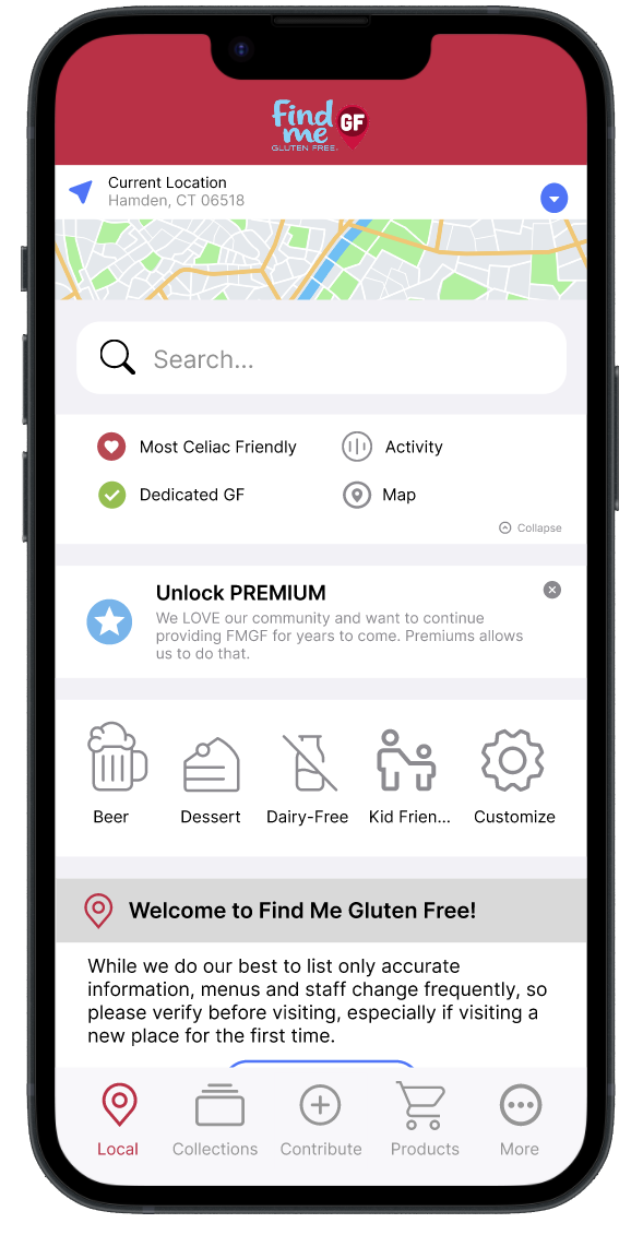
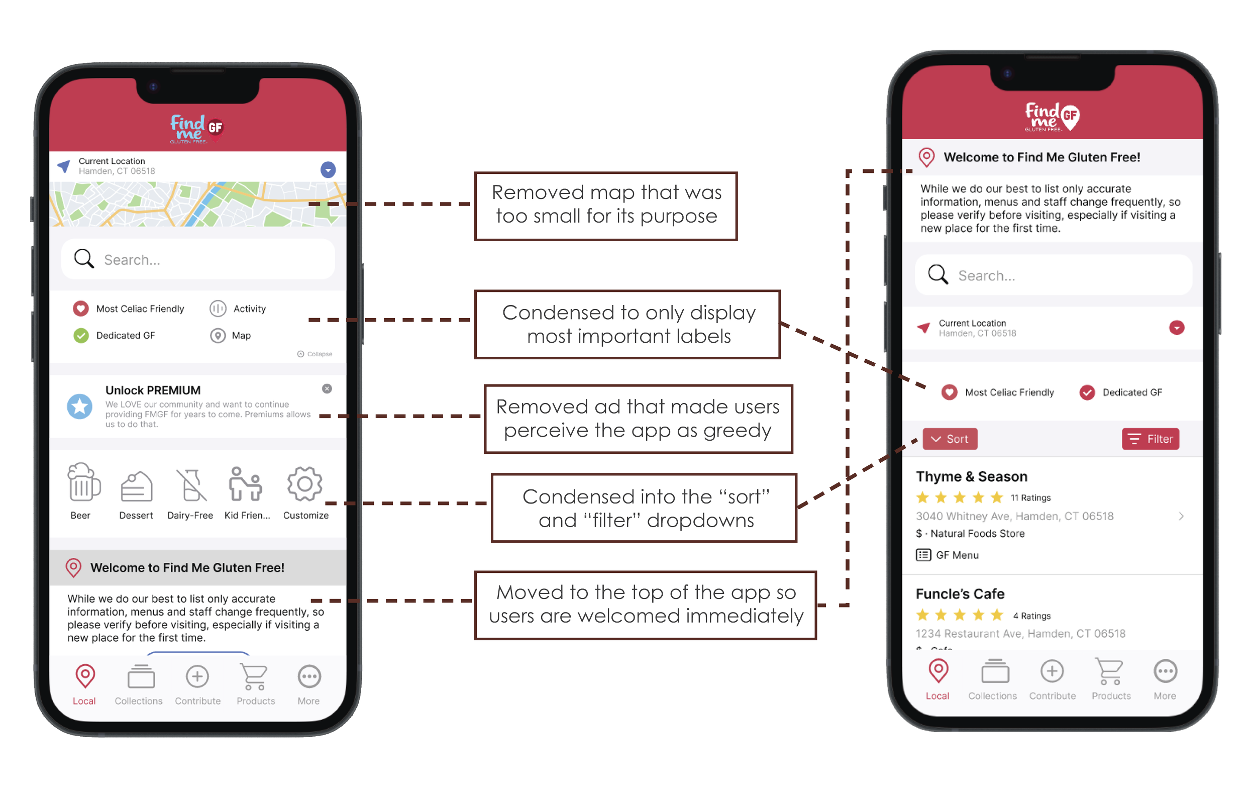
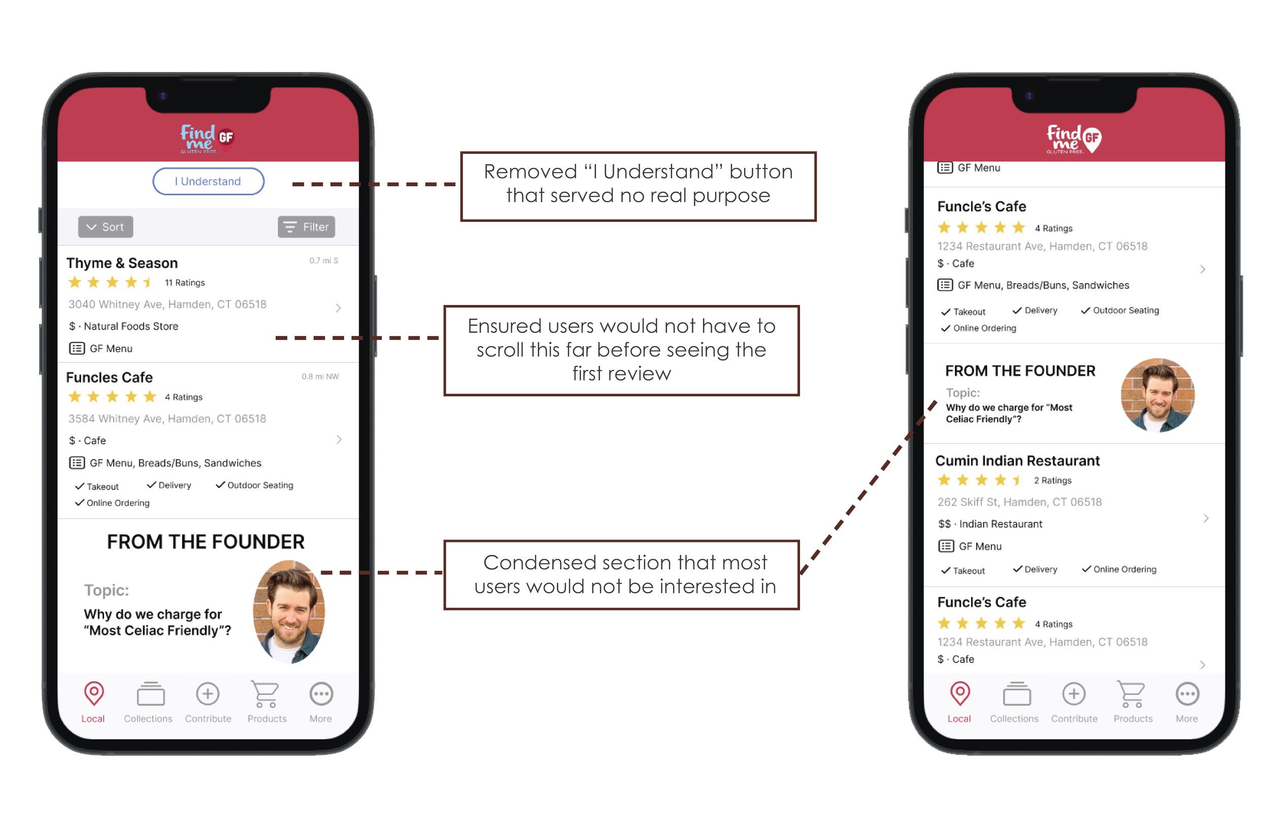
The main page is supposed show restaurant reviews, but reviews cannot be seen as the first feature on the page.
There are numerous blues, greens, and reds that don’t follow a unanimous color scheme.
Users are prompted with an advertisement to upgrade to premium before even being welcomed to the app.
There is a disclaimer which prompts users to click “I understand” after the welcome message. This button does nothing for user experience and takes up unnecessary space.
Review Page
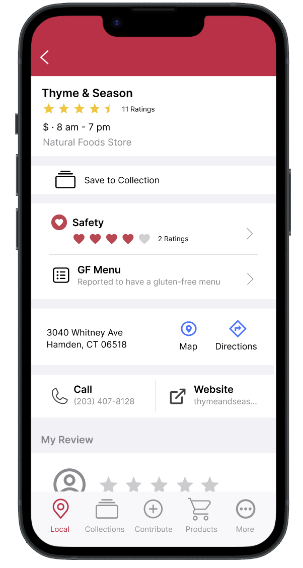
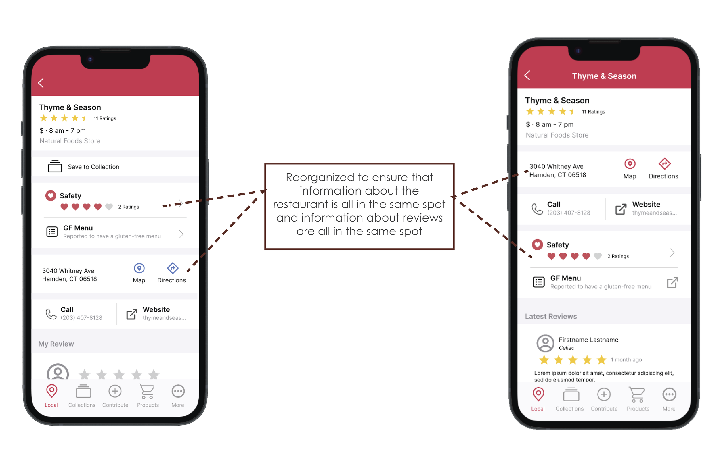
The page begins with information about the restaurant, then jumps to safety and menu reviews, before going back to information about the restaurant.
When users click on a page like this, they should be met with information about the restaurant first.
Users are prompted to write their own review before seeing the reviews of other people.
The page is cut by a very spacious “From the founder” section which has nothing to do with the restaurant being viewed.
Contribute Page
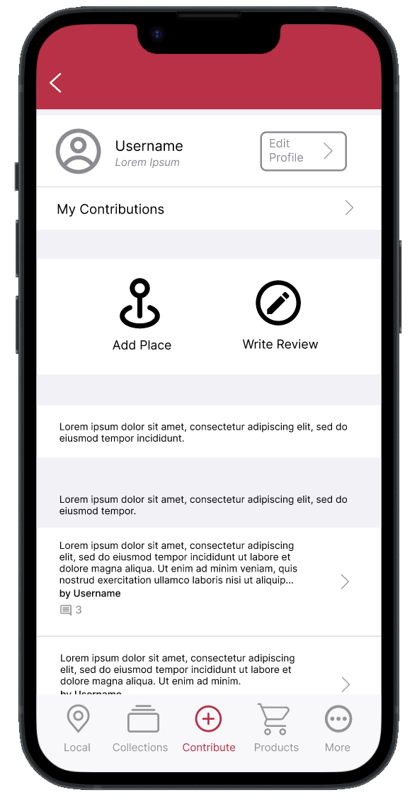
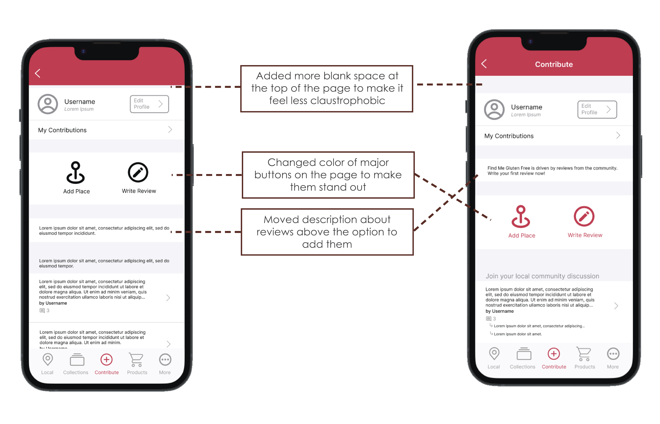
Adding users' own reviews and joining community discussion is a big part of the app, but the contribute page is underwhelming.
The page is supposed to facilitate discussion, but aside from the small icon to show reply number, there is little evidence of discussion happening at all.
The page is generally drab and has a lot of text which can be off-putting for users.
Redesign Objectives
Reorganize the primary app pages so that users will see the primary function of the page they are on immediately when they visit the page.
Redesign to remove clutter and redundancy to allow ease of scrolling and make navigating through the app and finding information easier.
Alter icons and colors to create a more cohesive color palette and more consistent design elements.
Changes that facilitate easier conversation and sense of community in the community post sections.
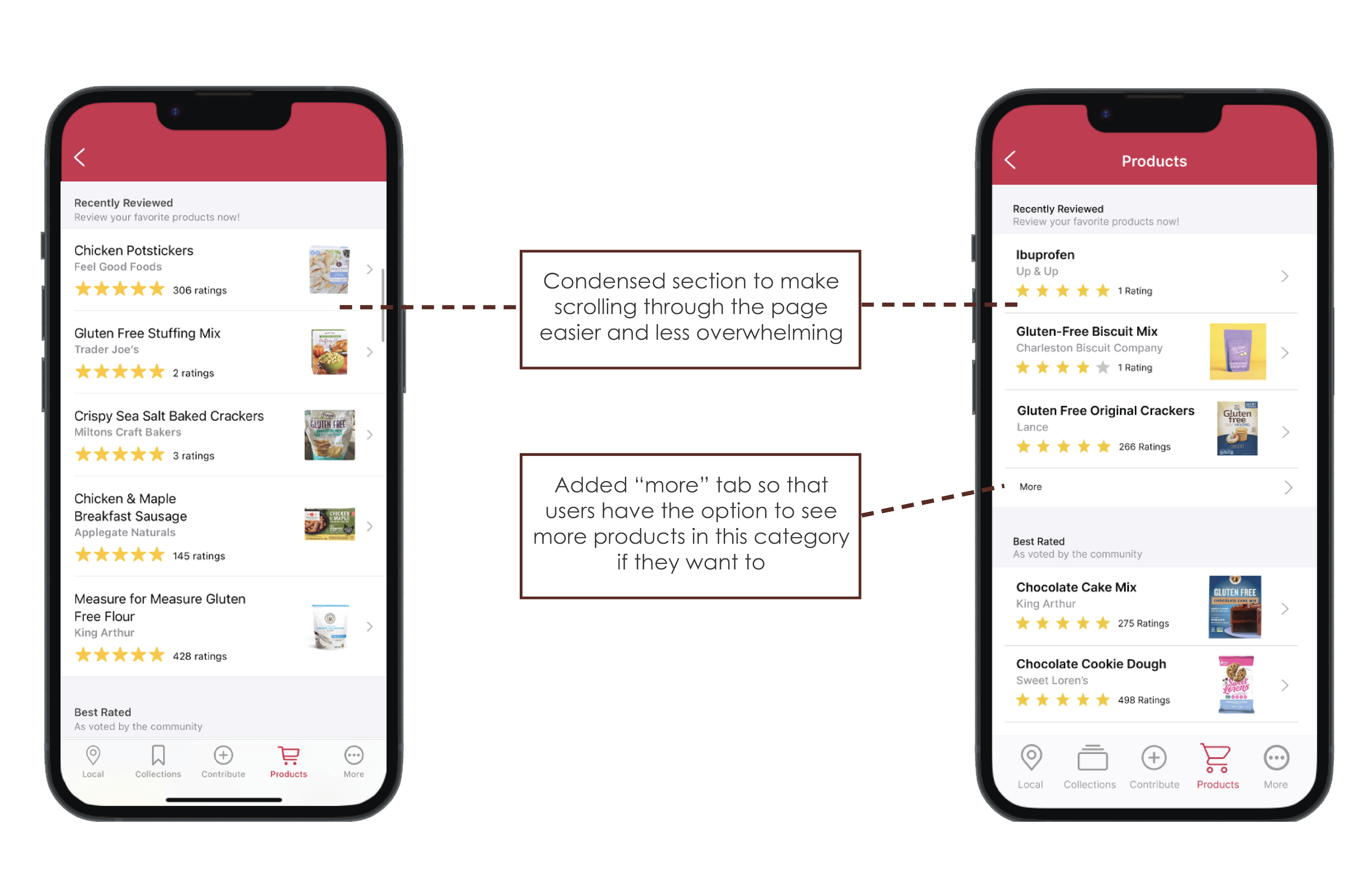
Adding a new horizontal sliding element to the products page to allow users to discover new products that they are looking for with greater ease.
The Process
Let’s get in to how the magic happens!
Step 1: Recreation
Recreating the original app allowed me to:
Pick out what worked with the current design and what could be changed.
Appreciate the simplicity in their current design, allowing users to navigate and parse information quickly.
Discover where there was redundancy and disorganization in the original design.
Step 2: Reorganization and color alterations
This step was dedicated to reorganizing the current design to:
Ensure that users can see what they’re looking for on a page immediately.
Condense redundant information.
Altered the colors on each page to make for a more cohesive appearance.
Step 3: Products Page Improvement
A new product page category slider was added to:
Allow users to find gluten free products by product category instead of searching for individual specific products.
Allow easier filtration to prevent users from being bombarded with all products.
Assist in discovery opposed to finding products everyone already knows about.
Step 4: User Testing
Four new users were asked to test the app and provide feedback:
User 1:
Ran into some prototyping errors
Back arrows should go back opposed to being linked to an actual page
User said it was easy to navigate and figure out
User was drawn to the elements in red
User will click off of a page quickly - content at the bottom of the page often did not get viewed
User 2:
Text on the collections page is too small
User searched for a way to add to discussions without clicking on the “More” tab
Text about reviews should be above the option to add them on the contribute page
User searched for a way to add a product
User 3:
User thought that the navigation was strong
Wants more color on the app
Writing your own comment needs to stand out more - maybe make it bigger or a different color?
Page titles are inconsistent - add titles to the top of each page
User 4:
User said that some pages felt slightly cramped and they wanted more wiggle room
User felt that navigation was straightforward and easy to figure out
User felt that it was easy to get to the intended purpose of the page
Everything’s functionality was clear
Step 5: Implement Feedback
The feedback provided from the test users was considered and implemented into the final redesign. This involved a lot of prototype fixing that was found necessary from User 1, organizational and functional changes that were found necessary from User 2, and aesthetic changes that were found necessary from Users 3 and 4.
Final Redesign
Main Page
Review Page
Contribute Page
Products Page
Learnings
The biggest takeaway from working on this project is the amount of research and work that goes into changes that seem awfully small on the outside.
The majority of this work was reorganizing existing assets - I expected simple organization to take significantly less time and testing than it did, but going through this process made it clear that organization is a huge importance to mobile apps and ensuring that assets are organized properly is not only a time consuming and complex process, but an extremely rewarding one to get correct as well.
Working for mobile is a lot different than working for print or other mediums.
With mobile apps, you do not have a lot of screen real-estate. Figuring out how to put emphasis on elements and keep everything readable is a lot more complex than I expected. Working with small icons requires a delicate balance between making them far too large on the screen and making them too small that the average viewer can’t figure out what they are.
